Maps and directions
We continue our discussion of the the OECD (Organization for Economic Co-operation and Development) Sustainable Manufacturing Toolkit and related items. In case you've missed the past two posting you can find details on the toolkit in and on line Start-up Guide.
Last time we looked at the seven defined steps from priority setting to performance indicators and normalization factors - factors that relate the level of performance to the individual product (piece, weight, volume) or to sales volume, etc. These factors could be based on production quantities in number, sales volume, hours worked, levels of service provided ("over one billion hamburgers served"!) or product lifetime.
The tool kit also discusses how to prioritize areas of improvement that can be focused on. One can use a degree of impact to assist with prioritization. For example, improving air quality may result in a significant environmental impact as well as business related impacts. "High" impact for the environment is defined as resulting in "significant damage or enhancement to the general environment" and likely to be "of great concern to stakeholders." This level of impact for the business side of the equation is defined a having "significant ramifications for business and reputation with potential for substantial losses or gains."
Medium impact is a lesser - moderate - view of above and low impact is minimal damage or enhancement of environment and ramifications for business and reputation.
One interesting visualization approach suggested is the "priority matrix" for showing, graphically, the positive or negative impacts in terms of key performance indicators. The matrix shows the relative impact in terms of both environmental and business effects/results. On the environmental impact axis contributors include: energy efficiency, air and water quality, use of toxic materials, use of renewable materials, greenhouse gas emissions and product impact. On the business axis contributors include: sales, cost, licence to operate, disruptions to operation and reputation/brand.
The illustration below, from OECD, shows the bands of high priority issues (dark) to low priority issues (light) in this matrix with a data point for each impact or, I assume, interaction between business and environment.

The impacts with the highest potential for improvement/damage are the first priority.
This type of visualization has been proposed by others as well and can be a powerful illustrative tool for showing present circumstances (in terms of environmental or business conditions) as well as plotting changes.
An excellent example of this is the Siemens "Eco-care Matrix". The eco-care matrix has along the x-axis the business or customer benefit and along the y-axis the environmental benefit. A presentation by the head of Siemens Industry Solutions Division last year explained that the concept is to allow the assessment of the environmentally compatibility and cost effectiveness of anything from a single product to a complete industrial system or plant. The figure below, from Siemens, illustrates the concept.
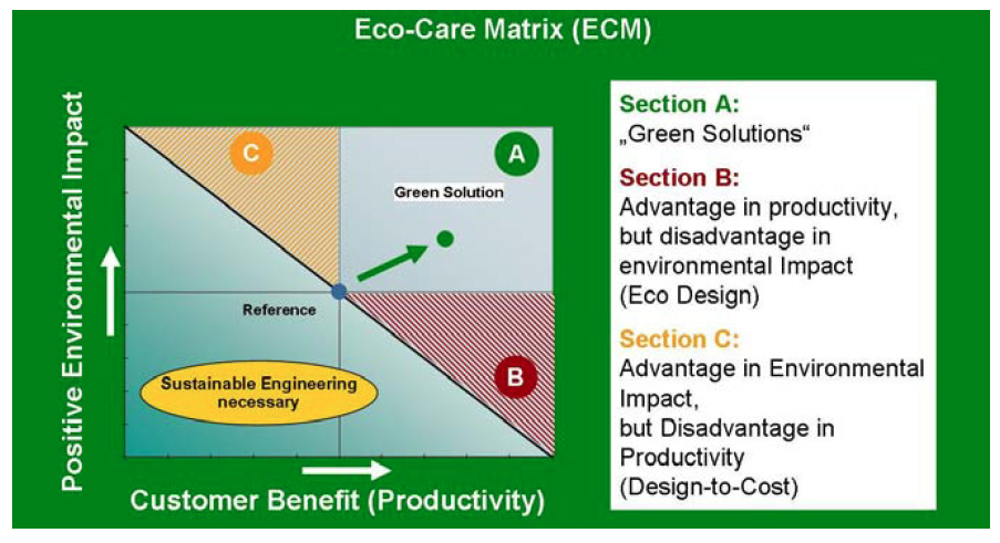
The reference dot in the center describes the environmental performance and economical customer benefit of one or more green solutions compared to a defined reference solution (usually an existing product of system.) The environmental performance is measured using typical life cycle analysis (LCA) outputs and, for example, can use the results of a LCA tool such as GaBi. The reference point, according to a published paper by Wegener (see reference below) is based on a system or product that "should deliver nearly the same function or service to the customer as the considered green solution. Only if both product systems under examination have the same function using of course different process technologies and product designs, their environmental impacts can be related to
the same functional unit."
The "new solution" is plotted on the matrix compared to the reference. Only if the trajectory improves both environmental and business benefits is the solution considered an overall improvement.
The economic benefit is determined using standard business accounting practices comparing the costs/benefits of the two alternatives.
For a detailed discussion of this approach, including an example and references, see the paper titled "Improving Energy Efficiency in Industrial Solutions - Walk the Talk" by Dieter Wegener et al from the Riso International Energy Conference in 2011.
A basic example is shown in a web posting from Siemens for a type of gearless AC motors used in dragline excavators — vehicles that pull a bucket freely suspended on a boom across earth or rocks in order to extract materials in large scale mining operations. The high efficiency of these motors makes the excavator 22 percent more environmentally compatible than the DC motor that serves as the reference, while reducing electricity costs by 22 percent.

Reading through the Siemens Eco-care Matrix methodology one can't help but notice strong similarities to the OECD toolkit approach. Concerns are on prioritization, normalization and the use of standardized metrics in the analysis to yield a realistic basis for decision making.
The OECD Toolkit also offers a number of case studies applying the methodology.
A logical process based on measurable impacts/performance related to realistic business outcomes and aided by a methodology for prioritization and progress tracking - all form a solid methodology for greening manufacturing.
Finally, I am participating in an Autodesk sponsored GreenBiz webinar on "Design Technology as a Sustainability Strategy for Manufacturers" on December 13th 2011 at 1PM EST. I will be joined in this webcast by Patrick Coulter, Chief Operating Officer, Granta Design, and Sarah Krasley, Product Manager, Sustainability, Autodesk. Joel Makower, Executive Editor at GreenBiz Group, will moderate the panel. You can find more info, and register for this free event, at the following GreenBiz link. Hope to "see" you there!
